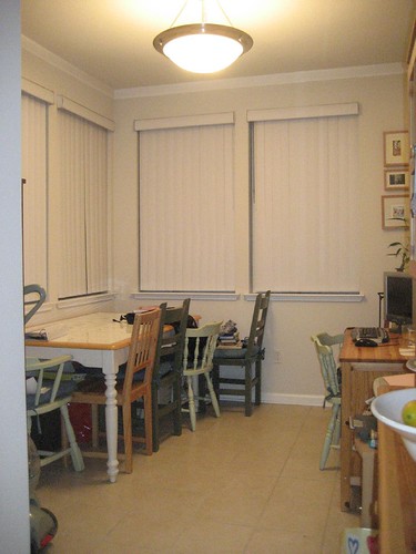
My dining room consists of a bunch of furniture that is all 8-10 years old, with the majority of the pieces having been purchased at Goodwill. At $40-$50, the table has definitely served me well, has hosted many family dinners, and I feel like it was money well spent. The chairs were also picked up on the cheap (including one rescued from near the dumpster and repainted), but recently I’ve started to feel like it’s time for “grown up furniture.”
Here’s a before shot… just to give you an idea of the space and what I have in it right now. If you click on the picture, you can see more notes, too, over on Flickr.

If you’ve been reading some of my recent posts, you’ll know that I’ve been enjoying blogs like Making it Lovely, and This Young House. Well, after the awesome inspiration of those blogs, the dining room didn’t stand a chance. I pretty much knew there were some updates on the way.
Based on some footwork, surfing, and checking out a lot of blogs, here’s what I’d love for the room to look like:

diningroom – by welcomingspirit on Polyvore.com
The rug and book case (book case will go on a wall to the left of where the picture was taken) are from Pottery Barn, and both are on sale. I actually tagged the rug in my Wists list about six months ago, I’ve been admiring it that long!
The art is from Mibo, and is actually a calendar that I am planning on printing, cutting up, and hanging in black Ikea frames. That makes it fairly cheap. And, I’m thinking those will be hung, in a grid, over the low book case.
Ideally, we’d have silverware from a professional antique silver shop to lay on the table when we have guests to visit. Something about matching silver cutlery just makes me feel like a proper adult (no more mismatched plastic forks!), so that’s definitely something on the wishlist. Plus, it’ll look so much better on the table at Christmas!
The desk in the picture (top pic) will get painted a dark brown or neutral color. It needs to stay in the room because we have a one-bedroom apartment, and we don’t have a lot of options for my guy’s computer. I’d also like to get a lamp for the desk that helps to tie it to the rest of the room. Maybe we’ll get a Handmade swan shape salt lamp that I saw at one of our mutual friend’s places. It looked really stunning near their bedside.
Finally, the small pictures on the upper right of the top photo will remain, also in repainted frames. As long as I don’t feel like it clashes with the other art. Having said that, one of my friends also suggested that I look into sites that have a decent amount of Contemporary Art Collection from which I can find art pieces that resonate with my dining room theme. I may consider this for my next makeover.
The main idea is that while it’s just us at home, we can push the table against the wall and leave the leafs in on the table. When we have company, we move the desk (its light) and center the table in the room to allow for full seating.
So, what do you think?

Comments
5 responses to “A Dining Room Do-Over”
Sounds awesome! I can’t wait to see the finished product.
Yeah, it’s awesome. I like most things from Ikea–wish I had a store closer to me.
I’m curious about the view from all those windows…?
Good question … with the blinds closed, the room looks so … blah.
The two straight across open onto bamboo that’s growing in between the two buildings in the apartment complex. It’s actually fairly pretty, its mostly green 🙂
The two on the left side of the room, though, those look out on the public hallway outside our door. The halls in the complex are all open (outdoors, not completely enclosed, but we’re on the second of four floors), and we rarely open the blinds on that side because it would mean people have a full view right into our dining room.
It’s funny, my guy and I were both thinking that picture made the dining room look pretty darn drab. I swear it’s a lot better in person!
Paula, you have no idea how envious I am. That rug has been in my mind for just as long. Except being in Germany, there’s just no way I would want to pay customs and shipping. It’s not something that I could fit in my suitcase. So I hope you get it and love it for both of us.
Katie
No Way Katie! Well now I kinda feel like I just need to buy it. I measured the room yesterday, and the 5×8 is our best bet. The room would just hold the 8×10, and I think its best to leave a little of the tile showing. (Otherwise “area rug” becomes “wall to wall carpet.”) It’s really too bad that there’s no 6×9 size.